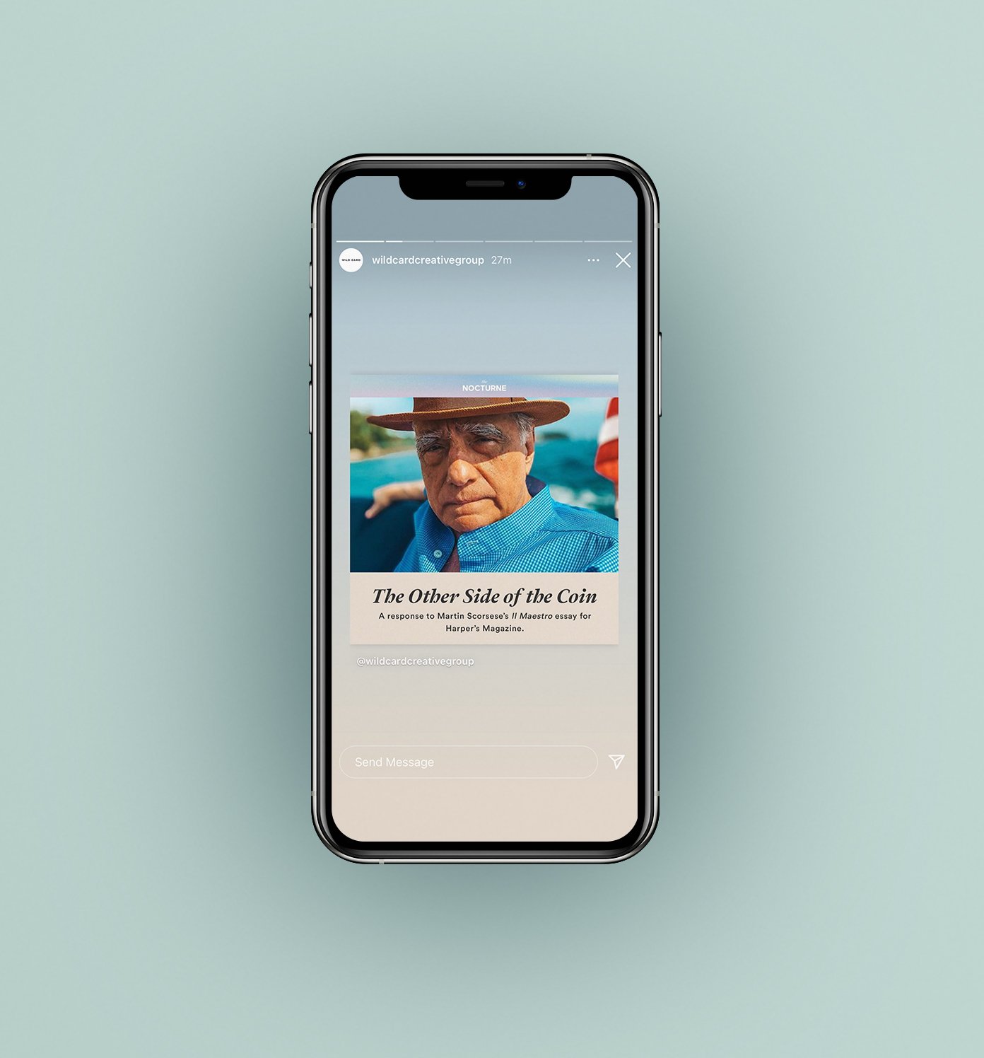
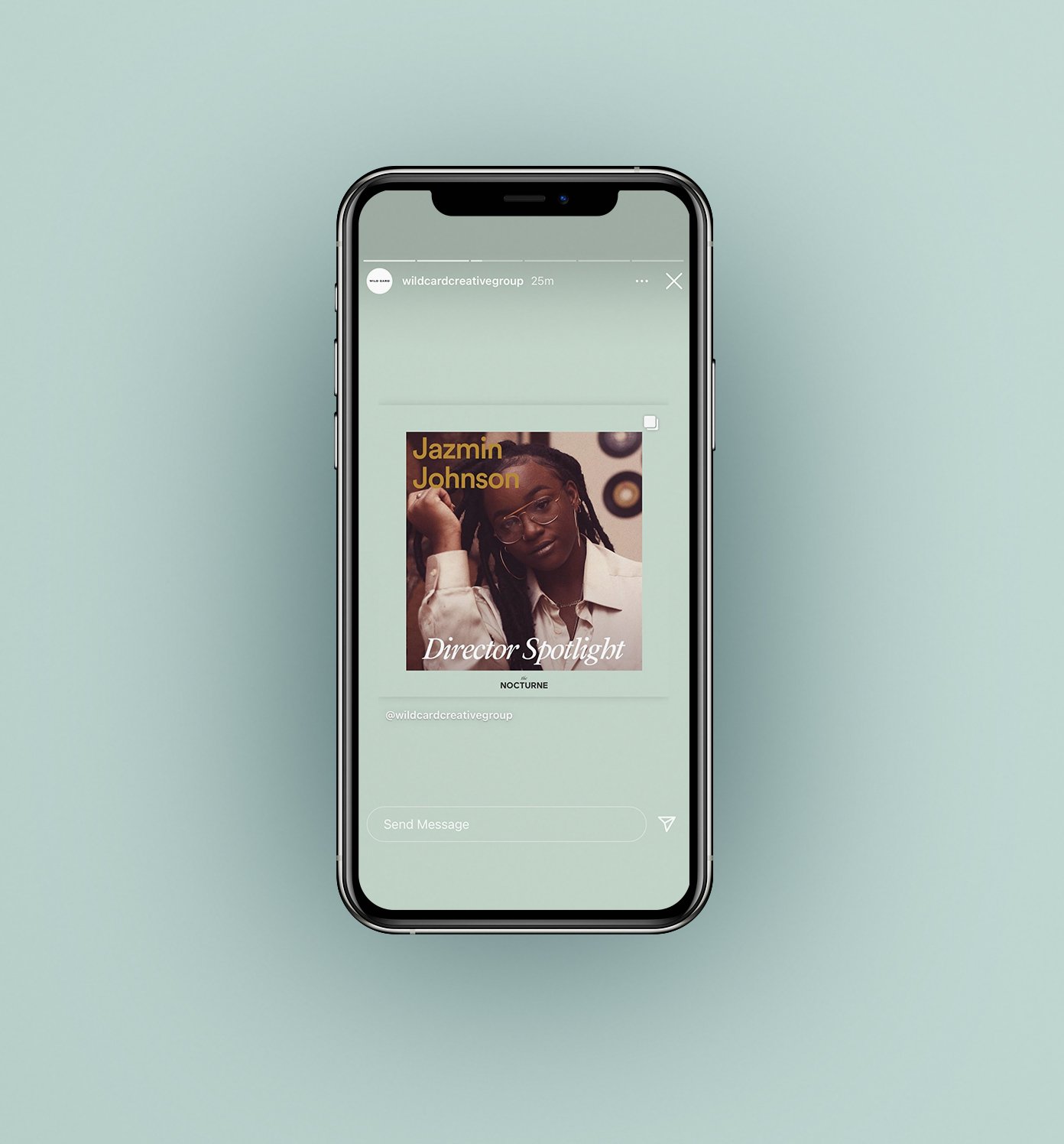
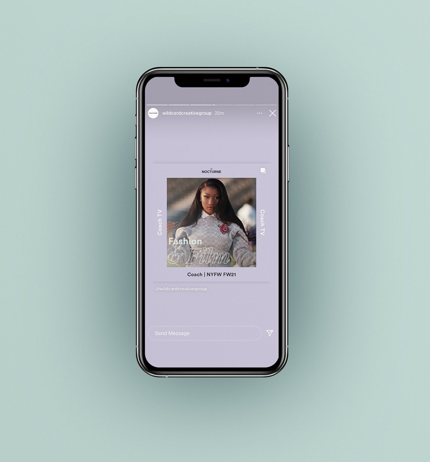
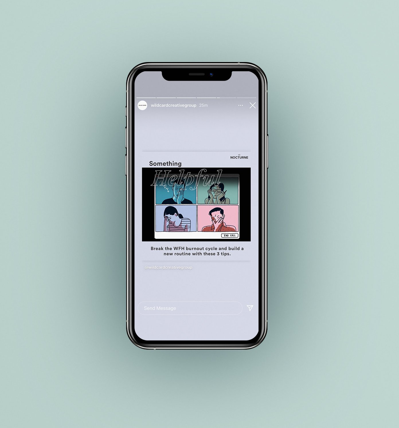
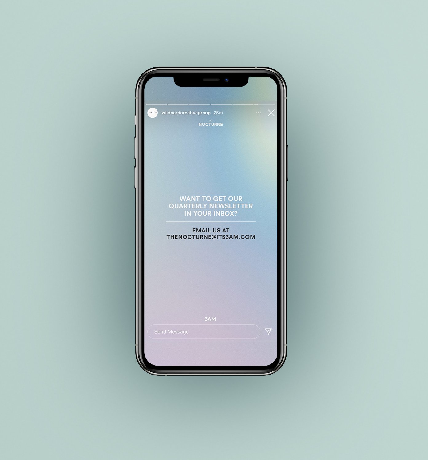
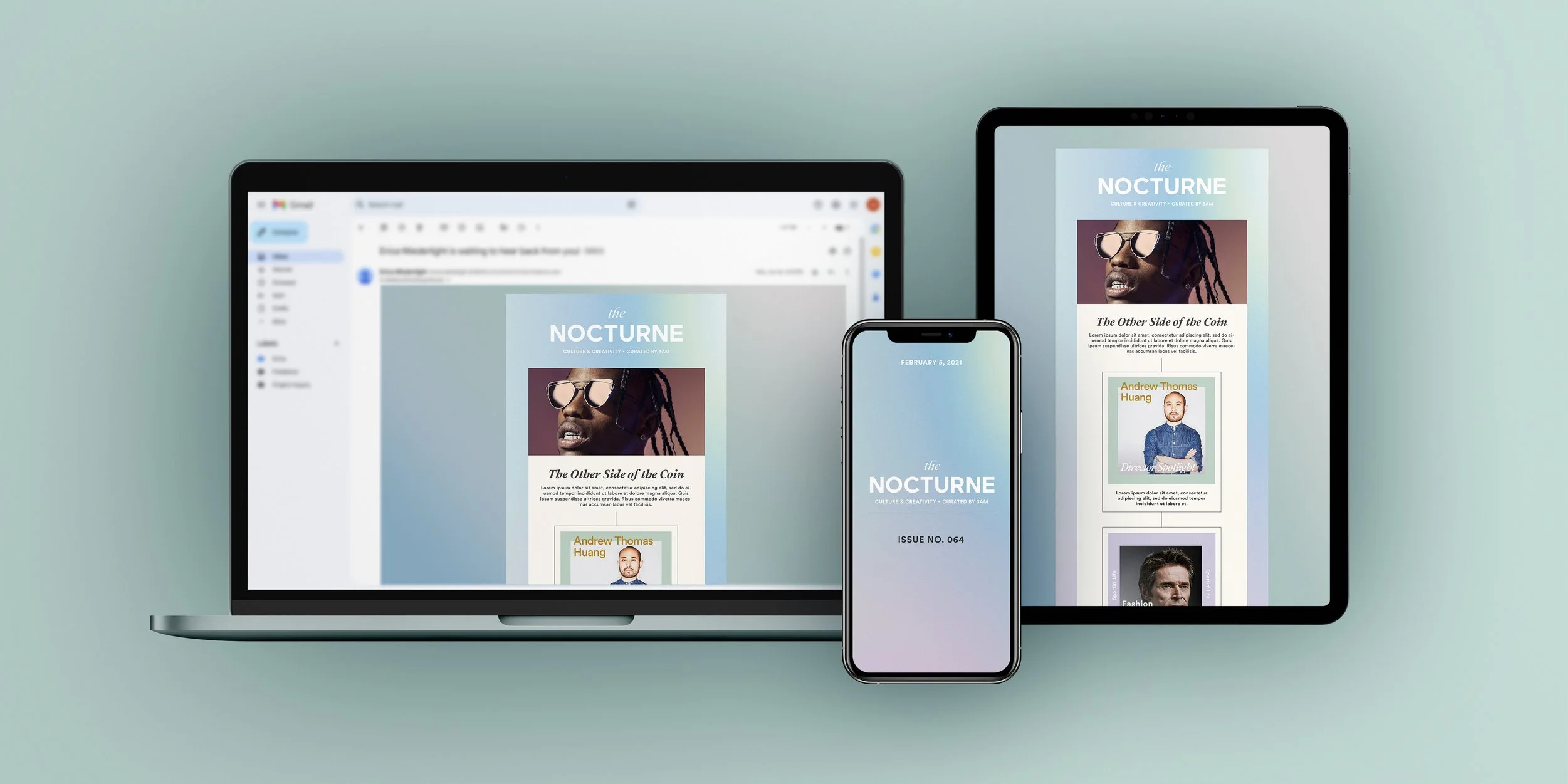
The Nocturne, created by Wild Card Creative Group, is a quarterly newsletter that the Insights/Strat team puts together to highlight cultural moments and insights as they pertain to marketing. To showcase and promote the newsletter, I was asked to develop templates for email as well as for IG (stories and in-feed posts) that would draw in new readers and gain new followers.
The client’s original design was all over the place and desperately needed some streamlining. Because we were taking pieces from different marketing campaigns, we needed to figure out a solution that made everything feel cohesive, professional, and engaging - a media source that could be trusted.
I created 2 design directions, each with a few color variation options:
DIRECTION 1:
Leans into soft color gradients, a pastel color palette, typographic overlays and a line design that pulls the eyes down through the length of the newsletter content
DIRECTION 2
An overall bolder approach that uses more vivid gradients, heavier fonts and color overlays
The client decided to go with direction 1 for the ability to easily integrate content into the design each quarter.
Below is Issue #64, a real-world application of the email newsletter and Instagram templates!

