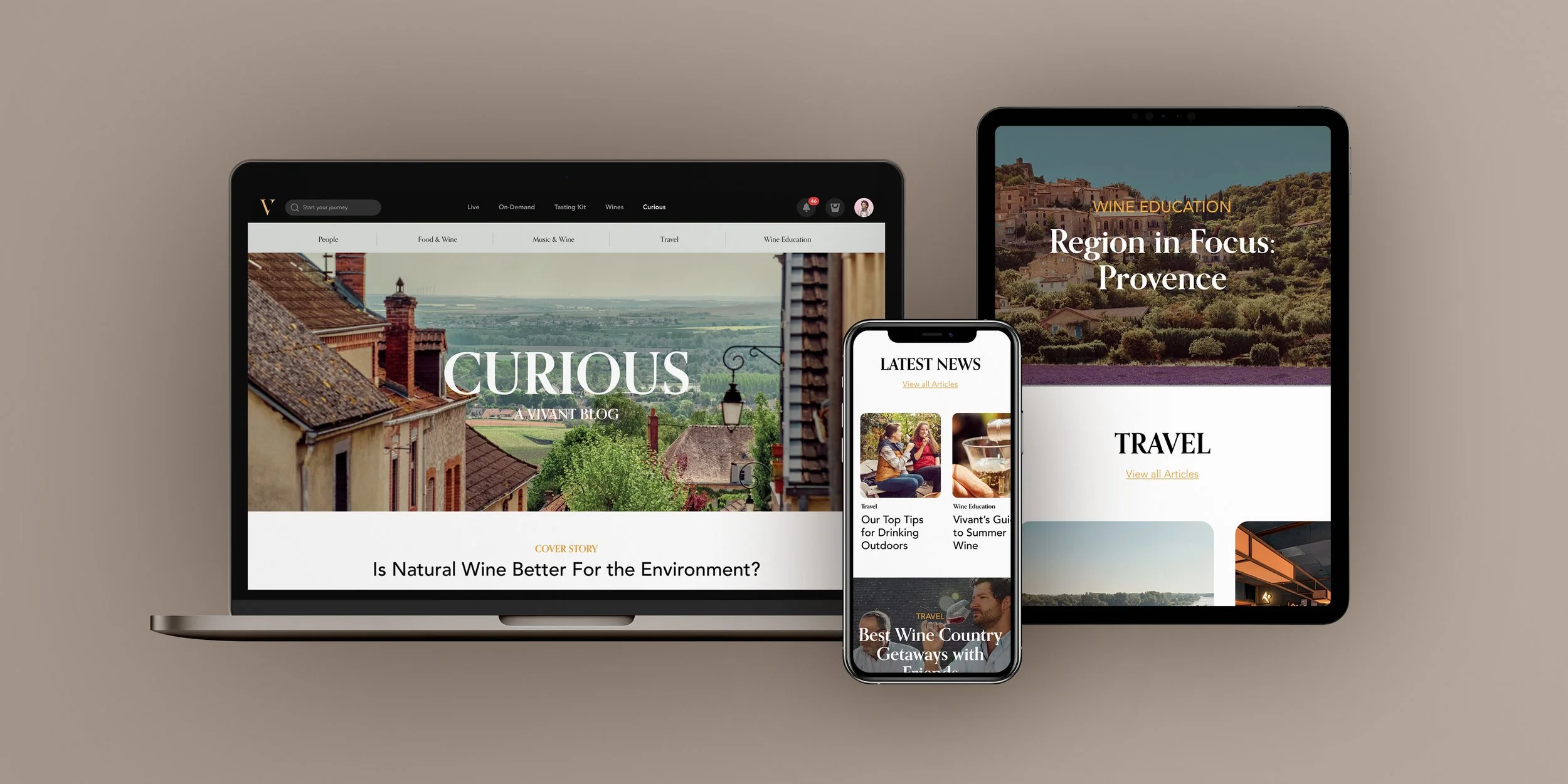
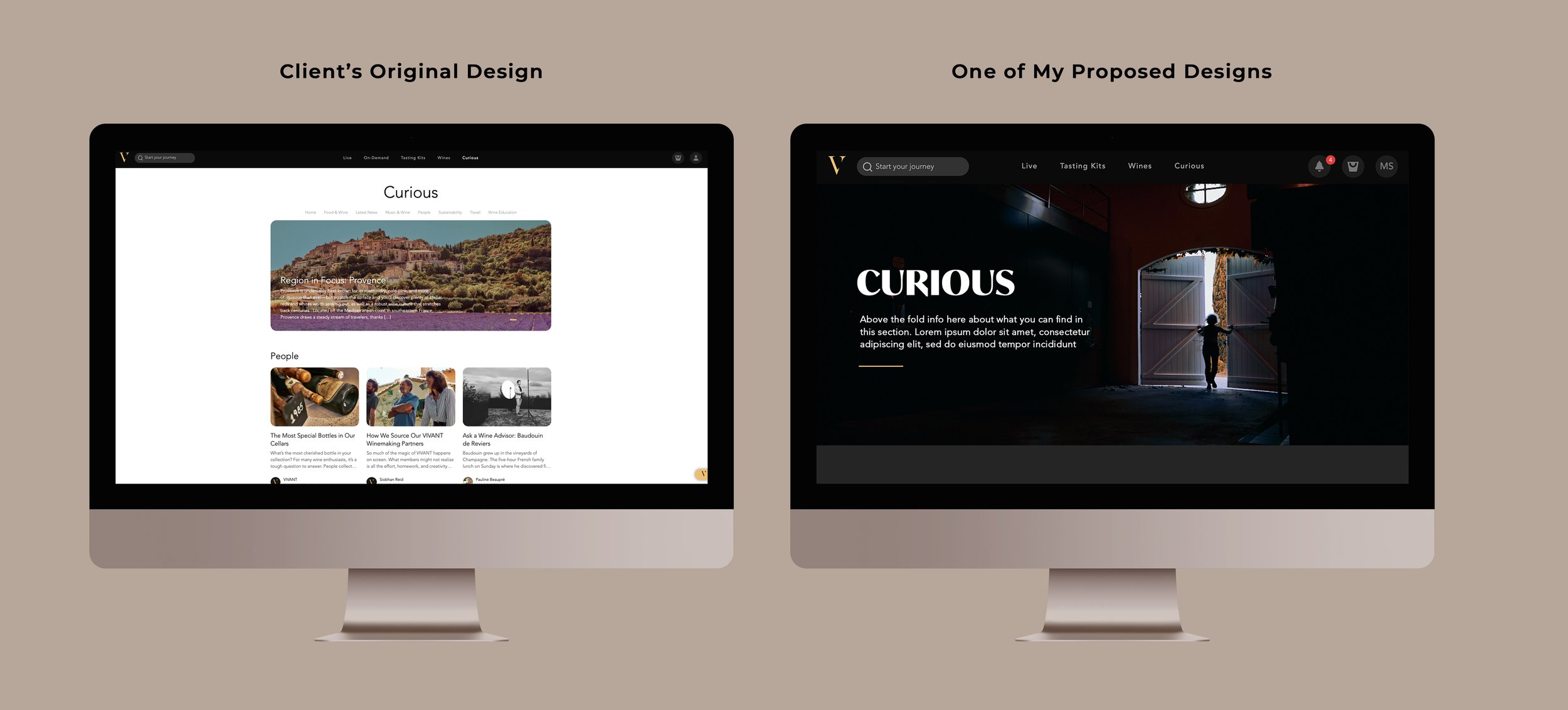
VIVANT, a Paris-based wine media site, is a digital destination dedicated to spotlighting sustainable winemakers in Europe. I was asked to help them reimagine the look and feel of the site’s blog which felt quite clunky, unsophisticated and amateur. They wanted to completely rethink the aesthetic so that it appeared more polished, elevated and editorial and was a nod to the site’s design with “a dose of magazine cool”.
Through the design process, 4 different directions were developed:
1) Classic Editorial- clean, refined, minimalist, lots of white space
2) Bold: vivid colors, flush imagery, bold type, overlays
3) Playful/Adventurous: Heavily leaning into graphic shapes/overlays and design elements
4) Feminine/Relaxed: Softer typography, cropped in photos
1
2
3
4
Ultimately, Vivant decided to move forward with direction 1 for its classic, clean aesthetic and ease of integration into the rest of their site.
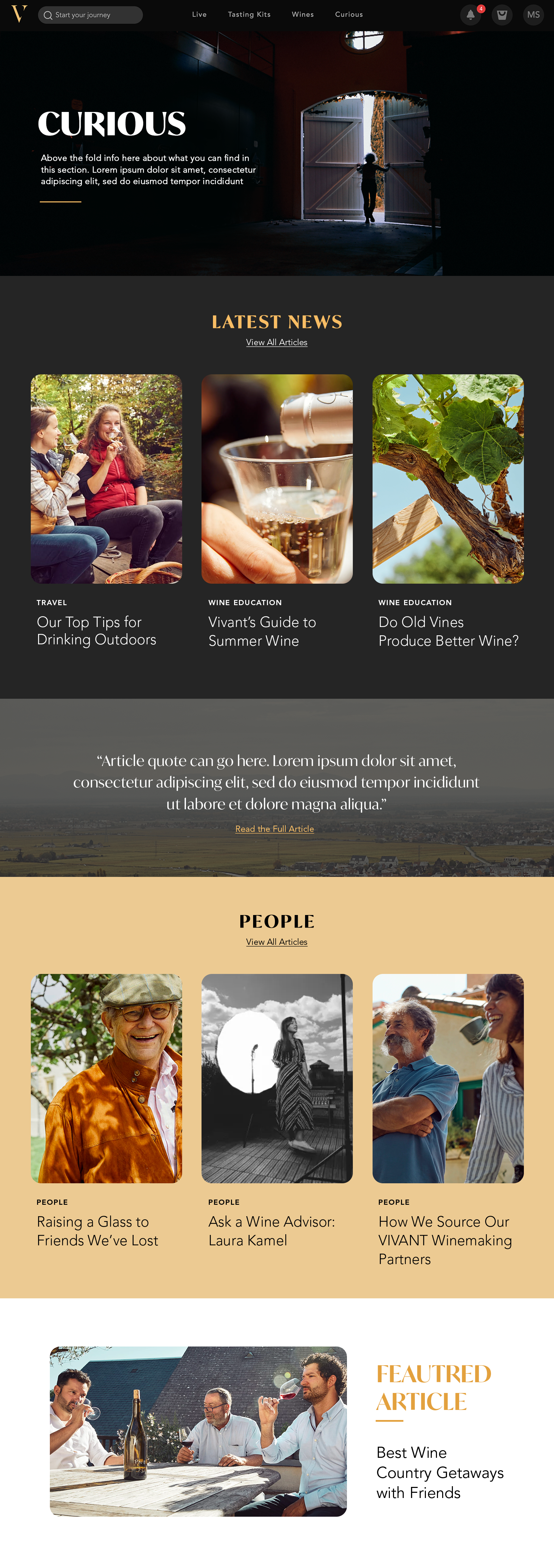
For a look at the full blog homepage design, keep scrolling!


