International WELL Building Institute (IWBI) is leading a global movement to transform health and well-being with their people-first approach to buildings, organizations and communities. They do this using their WELL Building Standard, a roadmap for creating and certifying spaces that advance human health and well-being.
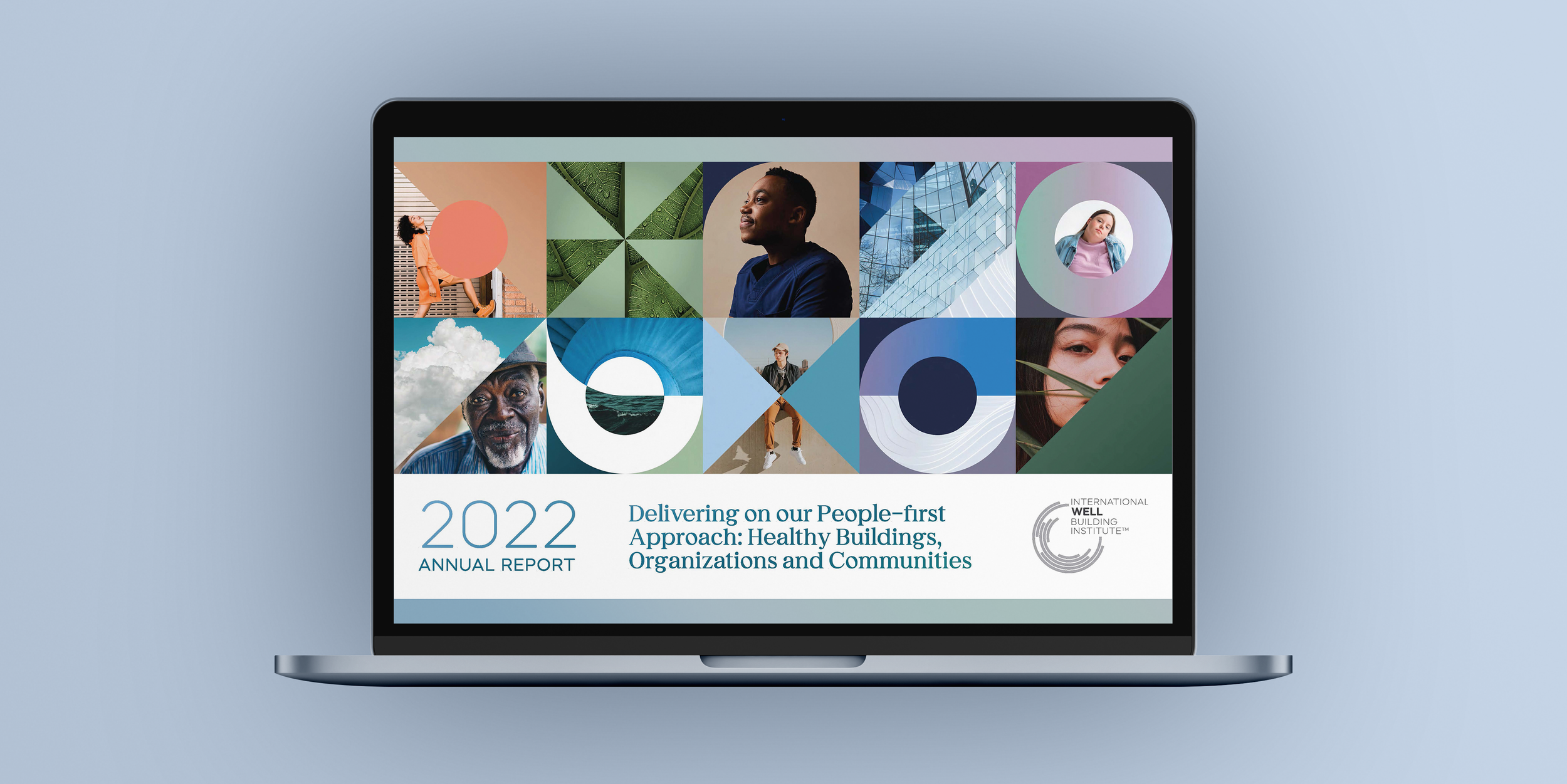
I was brought on to lead the design of their 2022 Annual Report; a robust document that gathers all of the new research/findings, projects, and community efforts made through the organization during the previous year.
The Process:
I was equipped with a 36-page copy doc and a few folders of assets. After direction from the Head of Design was given, I had free rein to run with the design. The ask was to use IWBI branding as a base but to develop a new visual identity that would set the report apart.
The few guidelines included: Clean/clear lines with gradient fills. A lightweight/bright feel that is broken up with some dark-mode gradients. Leaning into photography, geometric shapes and infographic moments to infuse visual interest. 1920 x 1080 dimensions (this would live digitally).
Moodboard I created that was used for inspiration:

A skeleton/ framework was created for the first section. Once that was approved, that portion was fully designed out with imagery, gradients, etc. Working in Figma was essential as it gave the Head of Design access to the document so he could easily drop in notes as I moved through each consecutive section.
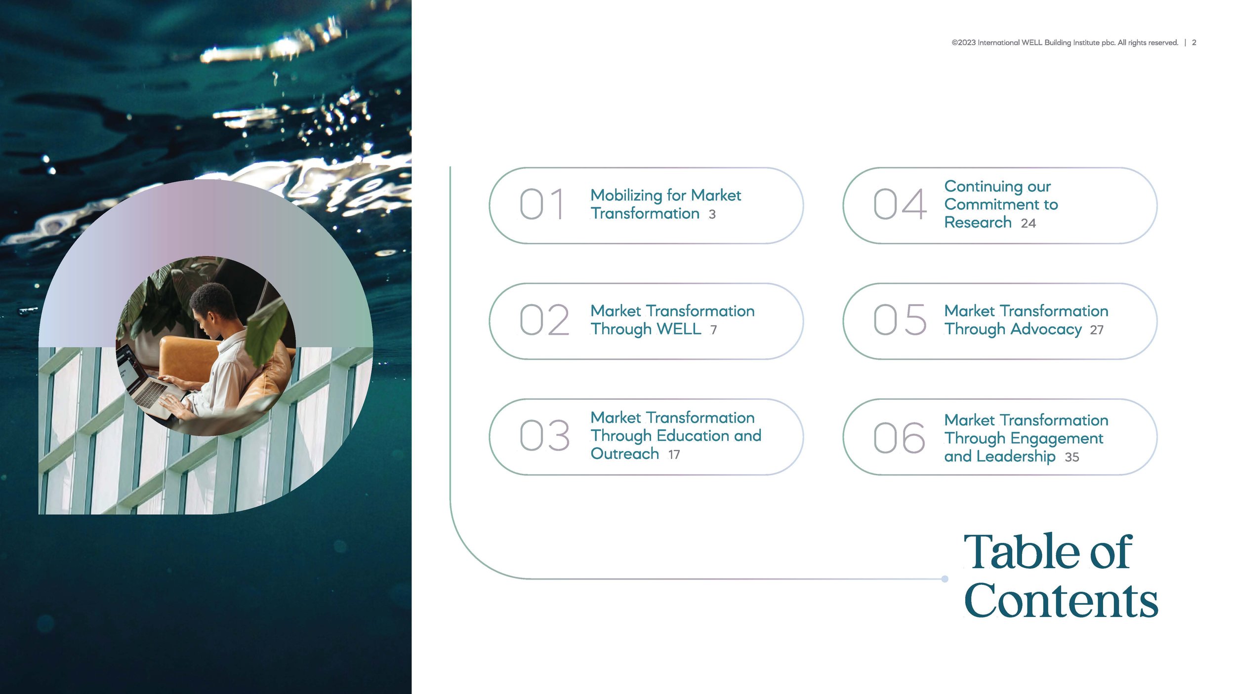
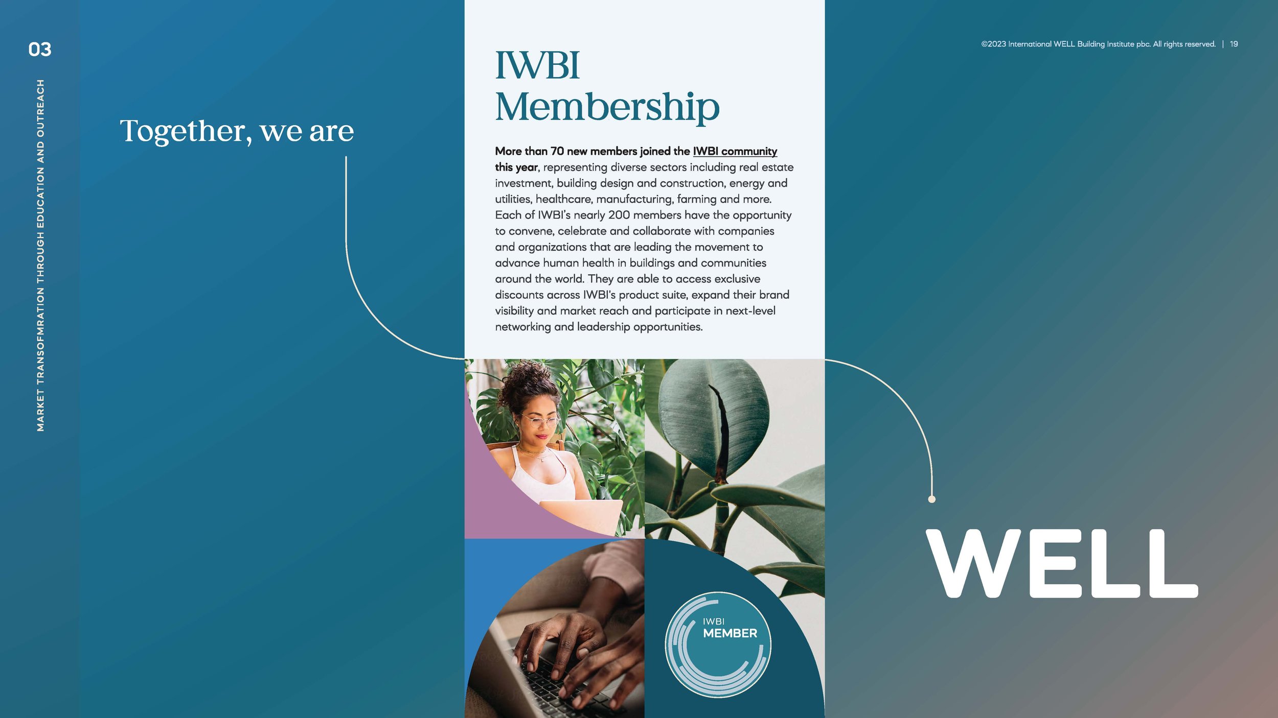
The Final Design Features:
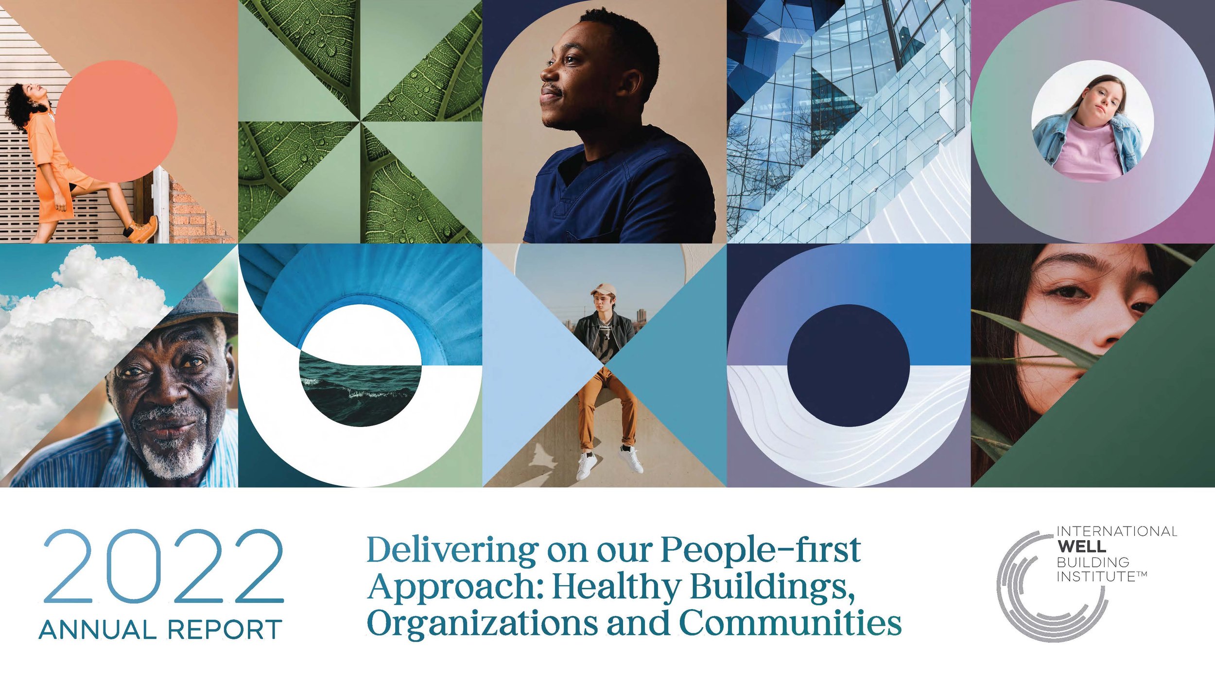
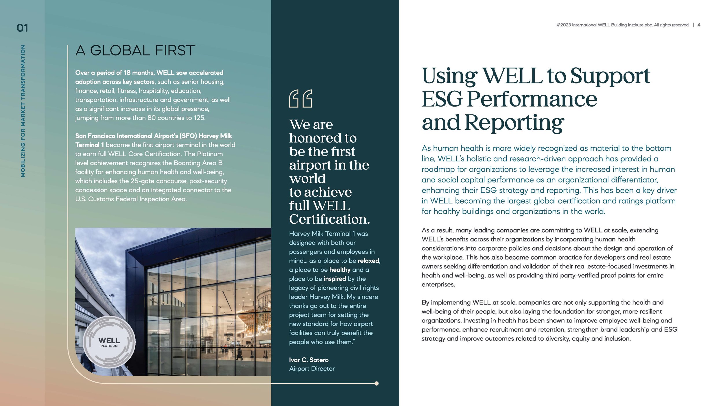
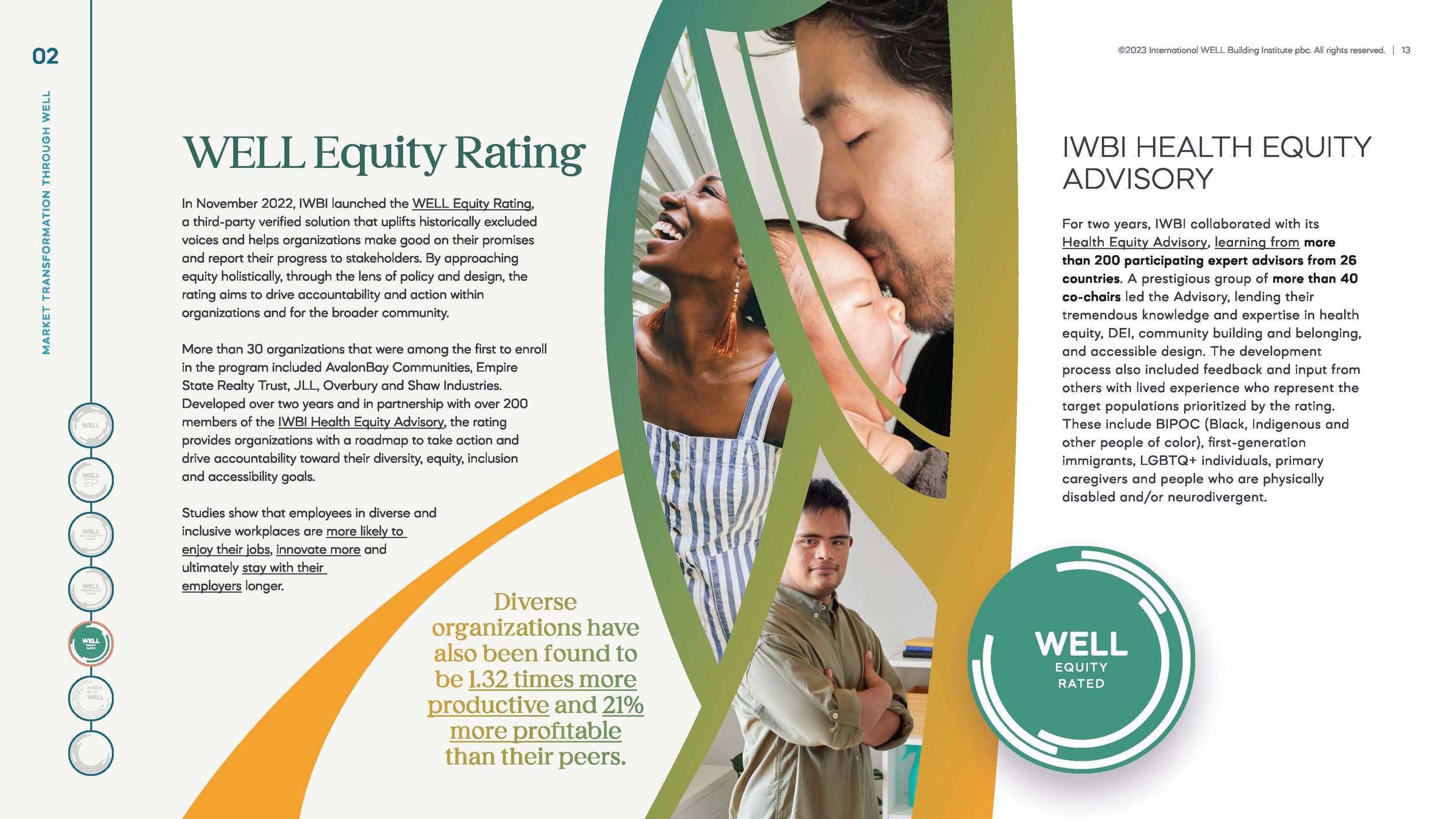
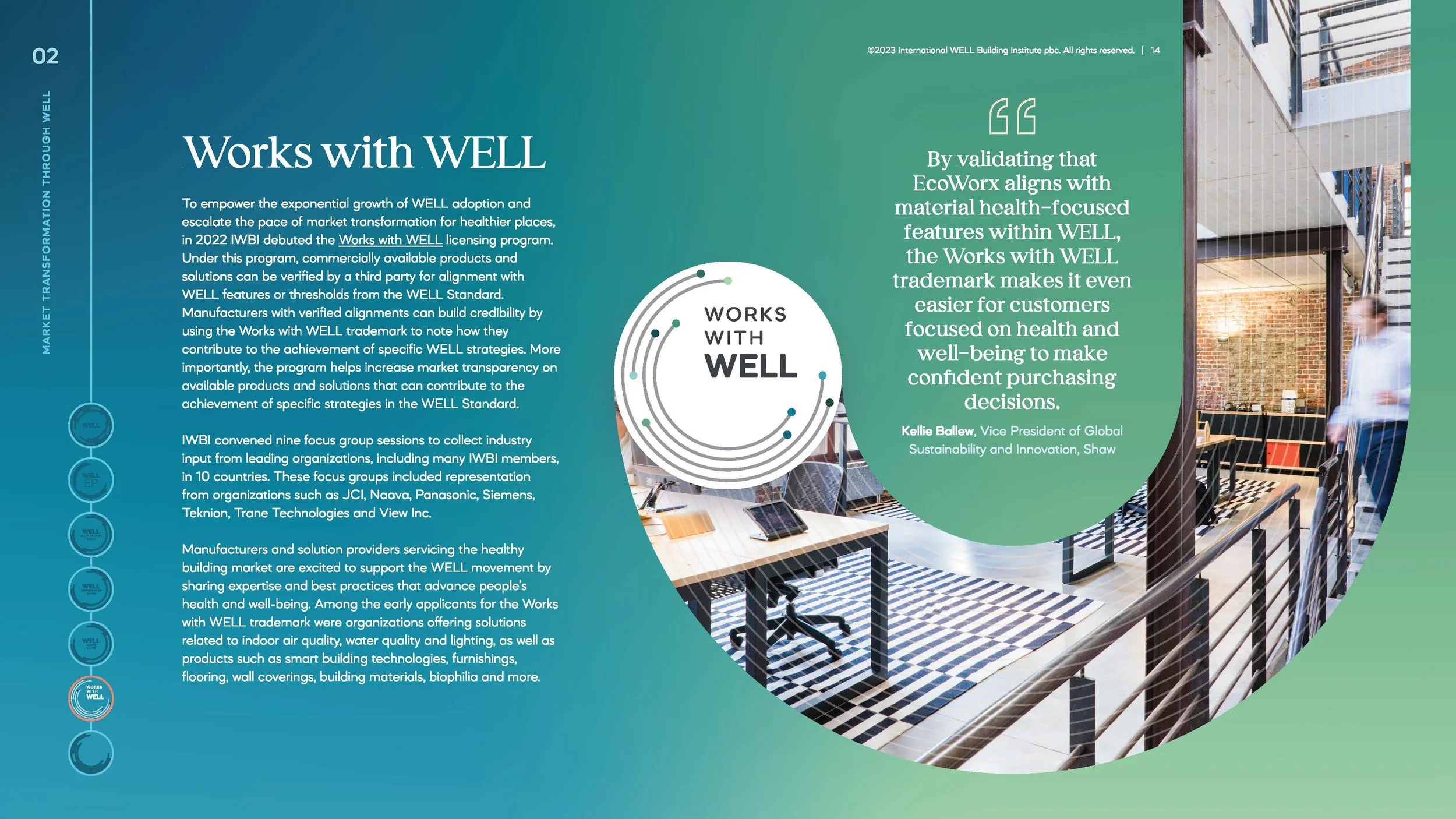
Bold people-first, elemental and architectural photography: Most of these images were cropped in closely as a way to convey the overall texture/feel of the image. Each photo was chosen carefully to ensure they evoked the main principles of WELL: humanity and well-being.
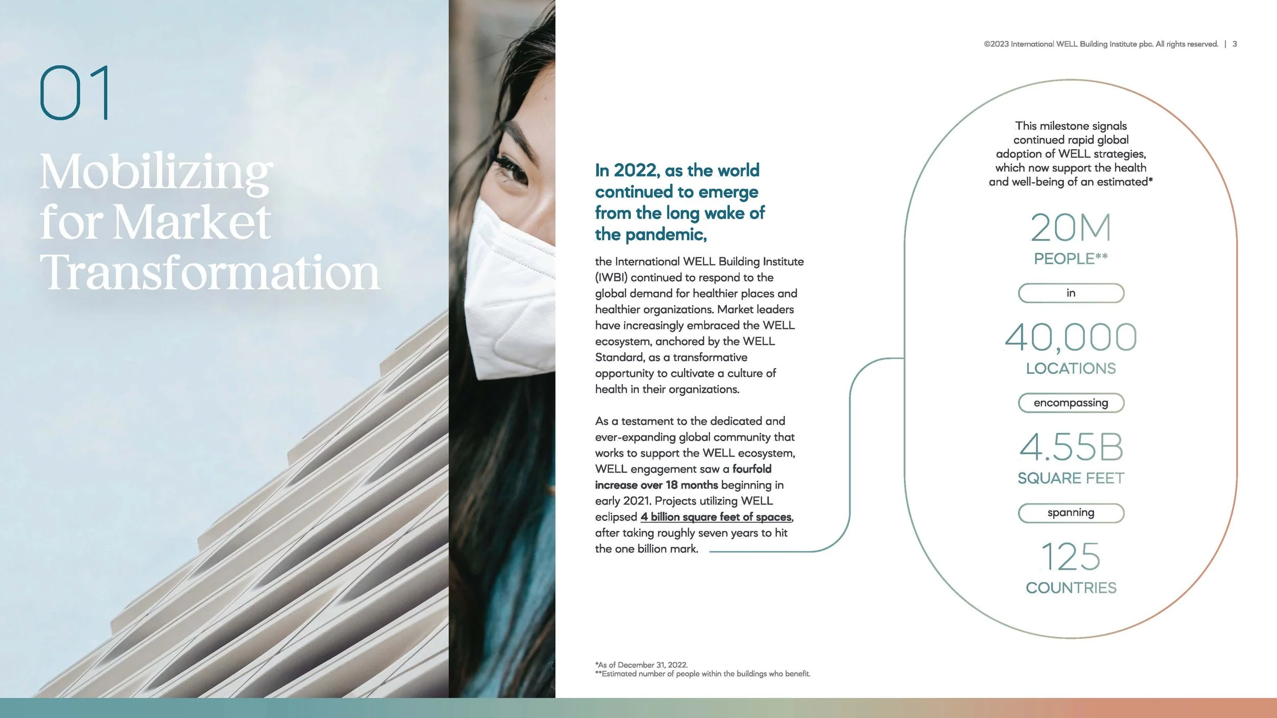
Soft gradients and geometric color blocks: Usually paired alongside or behind photographs, these were used as a way to keep design consistency across all sections.
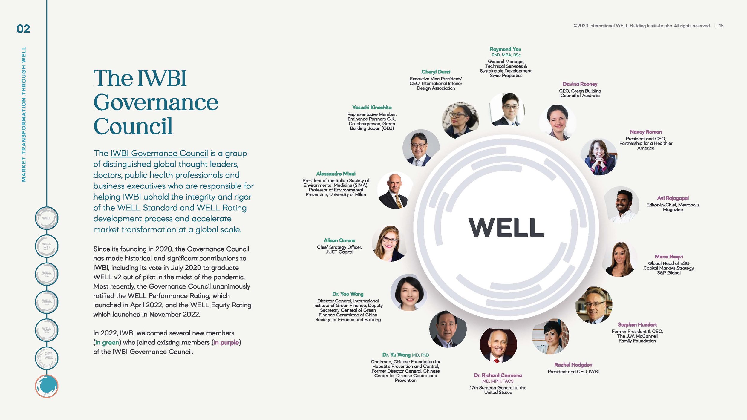
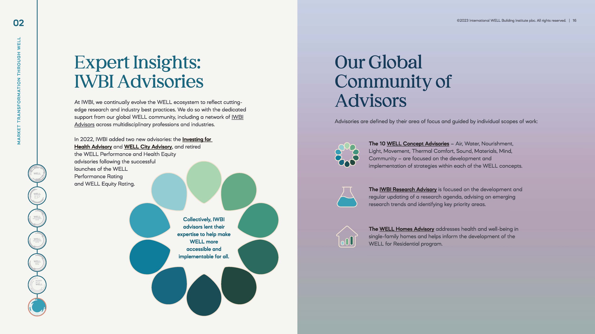
Engaging line work: A tool used to help guide the readers eyes across the page and throughout the document.
Page guide devices: Since this is such a robust document, I wanted to ensure that the reader had some visual guides that helped orient them within the content.
I was able to transform what could’ve been a long and mundane copy doc into a beautifully crafted report that is infused with intrigue and visual interest. Based on client feedback, I was successful in creating a visual identity that entices the reader and hopefully encourages them to explore more about IWBI and its offerings.


- Full Report Design -